What is MITRE ATT&CK?
MITRE ATT&CK is a globally-accessible knowledge base of adversary tactics and techniques based on real-world observations of cybersecurity threats. ATT&CK stands for Adversarial Tactics, Techniques and Common Knowledge (https://attack.mitre.org/)
Primary Goal of Feature Request
Enable SOC Analysts and Admins to easily access and explore MITRE ATT&CK coverage, including fully and partially deployed content and detection data, within the platform.
Process for Requirement Breakdown and Goal Definition
Connect with PLM (Product Line Management): Collaborate to understand the product goals and vision. Engage with Subject Matter Experts (SMEs): Gather in-depth insights and technical requirements. Dig Deep into Requirements: Analyze user needs and pain points for a comprehensive understanding. Breakdown of Goals: Create smooth, logical paths for users to engage with the platform.
Key Learnings from Collaborating with PLM, SMEs, and Analyzing Requirements
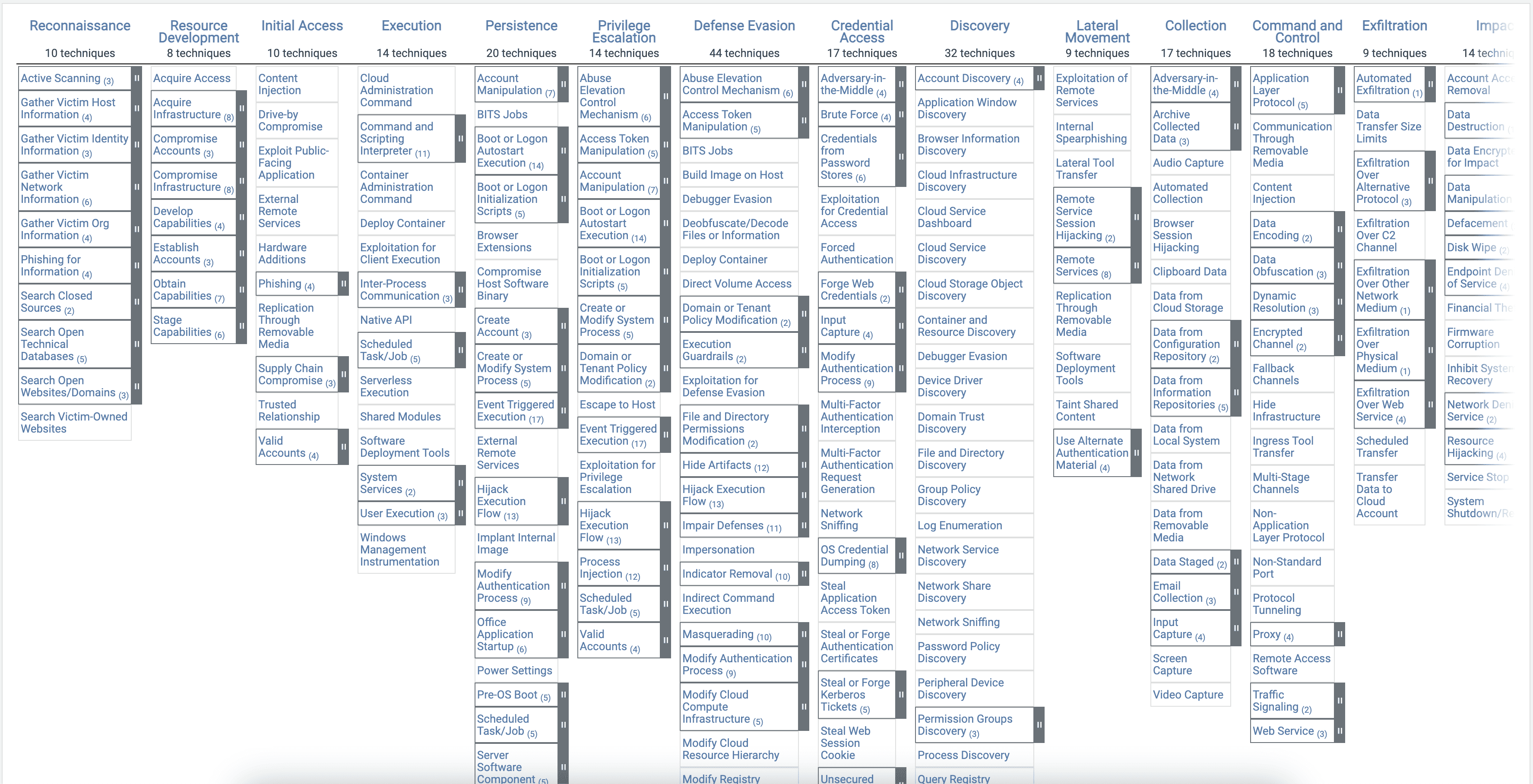
Comprehensive MITRE ATT&CK Coverage Overview
Users should be able to view all similar MITRE ATT&CK content coverage view in their environment, including tactics, techniques, and sub-techniques, without needing to interact with any detections whether partially deployed or completely available
Visibility into Detection
Users should be able to see detection counts for each tactic, technique, and content piece in their environment
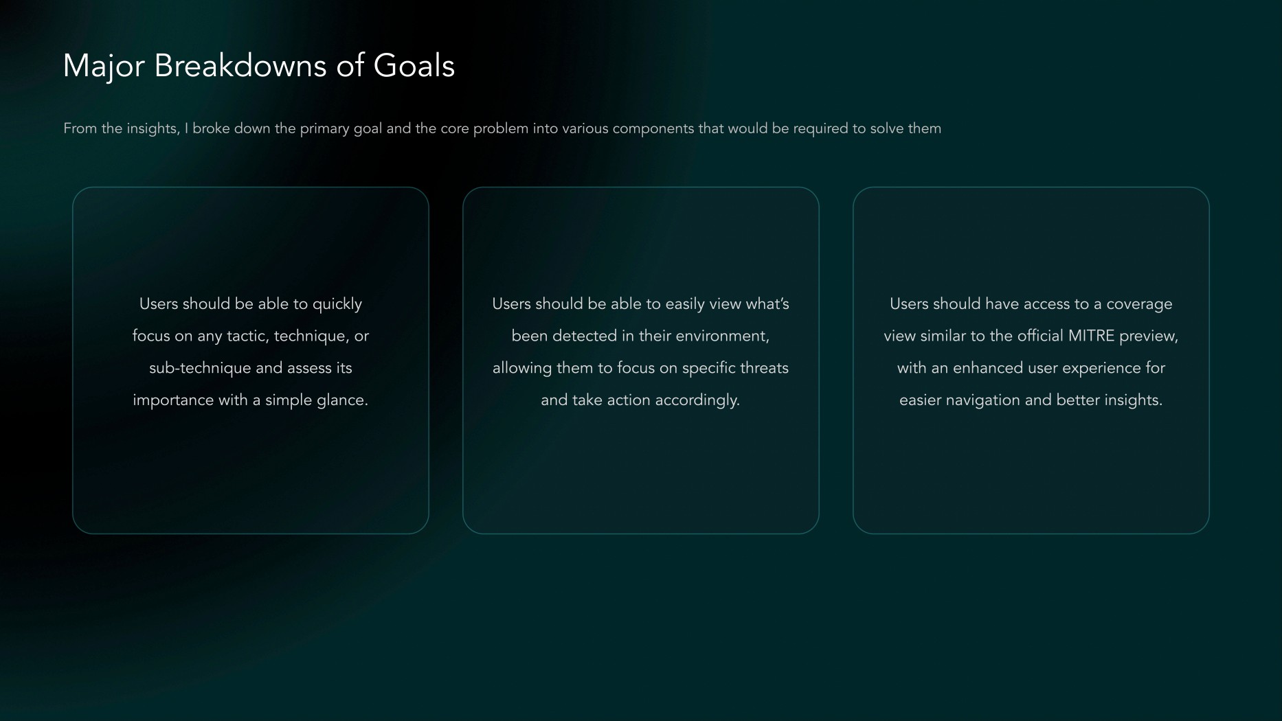
Effortlessly Focus on Threats
Users should be able to quickly focus on any tactic, technique, sub-technique, or content, easily finding relevant detection and coverage details.
Coverage: The coverage shows all MITRE ATT&CK tactics, techniques, and sub-techniques in your environment, helping users see what is covered and where gaps may exist. Detections: The detections widget displays the threats and activities detected across your environment, allowing users to focus on areas with detections importance for your environment.
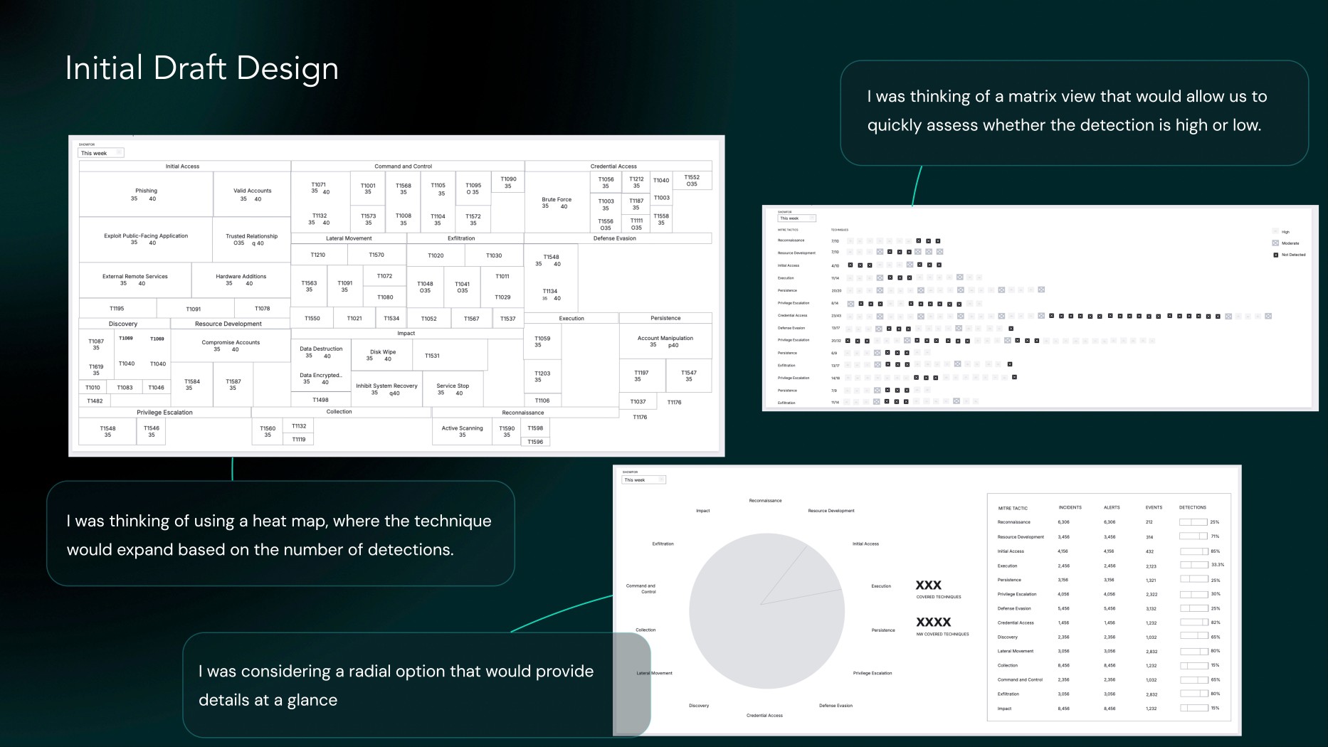
I started with Detections workflow because coverage was something we already had but needed an enhanced UX
Steps for MITRE Detections Design Building on the initial understanding Designing the Solution
At a glance, users should be able to understand the detected techniques and their significance. The number of threats for each tactic may vary by system, and users will need to filter based on their specific context. There should be a detailed view where the analyst can dig into the specifics, including the severity of incidents, affected hosts, and other relevant details. The visualization UX was still somewhat unclear, requiring further exploration. However, a few key aspects were clear, which I focused on: 1. Users should be able to see detections at a glance. 2. Users should be able to dive deeper into the type of techniques, tactics, and sub-techniques.


Next Steps
Proactively shared IA, wireframes, and initial design drafts with multiple stakeholders to gather feedback and facilitate iterative design changes through several feedback sessions.
When the UX was at a good stage internally, presented to some top Fortune 500 companies customers to gain their insights.
Afterward, trade-offs were made to prioritize the MVP and help users achieve their goals
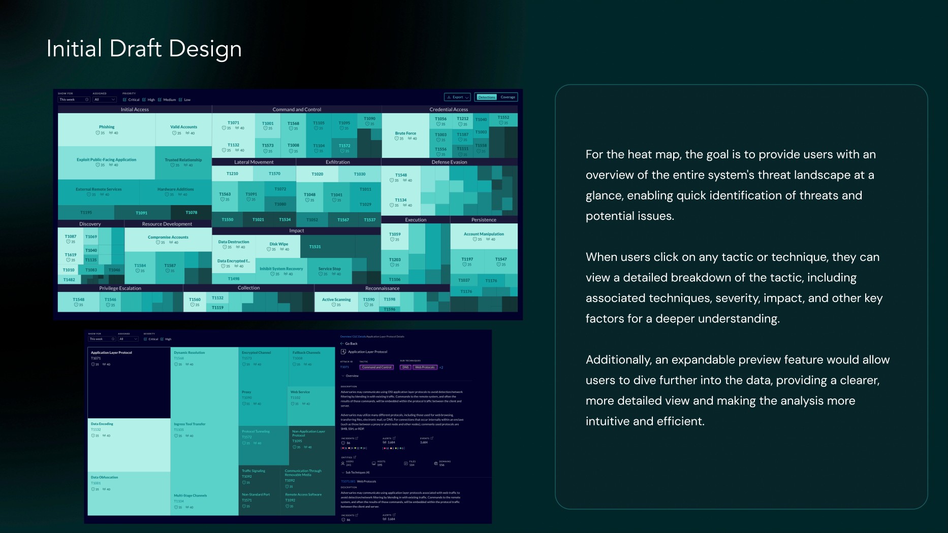
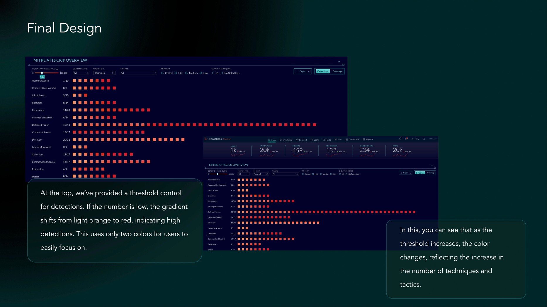
1. Users can easily focus on the matrix view. Colors are sufficient for them to distinguish between high and low detections.
2. In matrix view we presented multiple color options, but users found it difficult to focus. They needed a way to highlight only high detections. No need of number of total threats detected as it don’t bring any value.
3. Different user roles face different types of threats for each system, so there should be a way to control the number of detections. Users should also be able to mark number of threats as threshold to focus on them.
4. Users should be able to explore details, with the option to view technique IDs for those who need them. They also need an export functionality to share the data. Additional filters should be implemented, including a threats categories, allowing analysts to dig deeper into the data.


Now, For MITRE Coverage
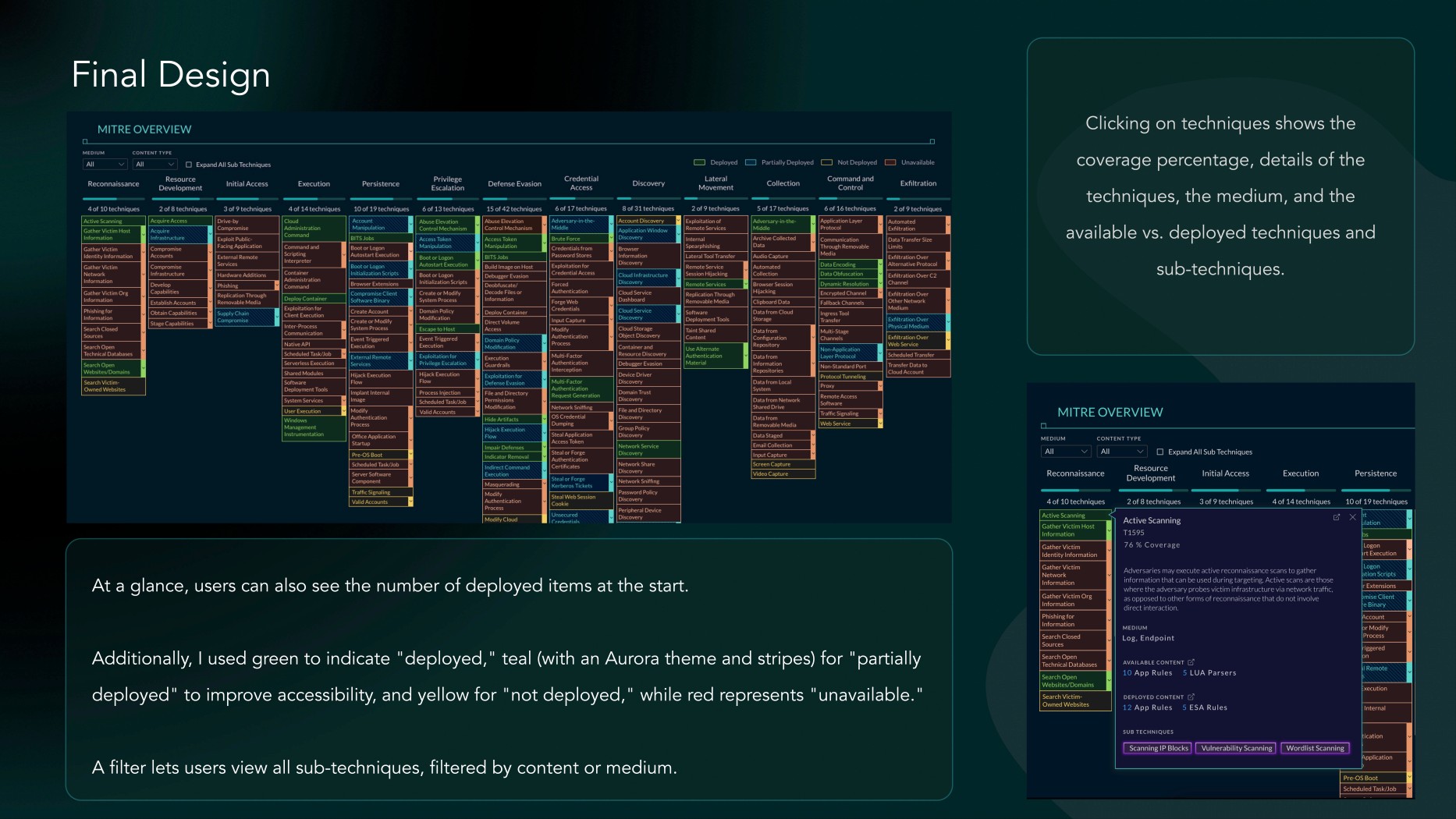
In my legacy UI, The platform represented the MITRE coverage as shown below. However, I wanted to enhance it according to my Aurora Design System, which was being implemented across the platform. I aimed to retain the same layout because it's consistent with the official MITRE website, and my customers are familiar with and prefer this format. Therefore, I focused on enhancing it while maintaining the familiar design.

Now, Goal
To provide users with seamless access to all MITRE ATT&CK coverage and deployed content in the environment, while ensuring they can easily discover and explore tactics, techniques, and sub-techniques, as well as related content. I connected with a couple of customers to understand how they currently interactaction with the system and whether they would like any changes: 1. Customers are accustomed to the current interface, as it has remained largely the same for over 10 years in official MITRE website as well. 2. They find it difficult to quickly determine the status of mapped content at a glance. 3. Some users expressed a need for better visual indicators to differentiate content status more clearly. 4. They would appreciate a more intuitive way to filter or search for specific content. It looked more like a visual design enhancement on a larger scale, with some UX enhancements as well. Next Steps, Connect with PLM and SMEs to gather their insights as well.


Thank you for reading.
I hope you liked it.

